Ashley Zacharias
Data Analyst

DoorDash:
A Marketing Analysis using Excel
DoorDash
Excel
Introduction
As a leading tech company that connects consumers with their favorite local businesses in 27 countries across the globe, DoorDash delivers the best of your neighborhood on-demand in partnership with thousands of restaurants, convenience stores, pet stores, grocery stores, and more. According to its website, in 2021, DoorDash supported 6.8 million Dashers and other workers, $68.9 billion in U.S. GDP, 500,000+ merchant partners, and 1.39 billion consumer orders globally. These impressive statistics would indicate that much value is placed on the work done by their technical and analytics teams.
Task
As the newly hired Marketing Analyst for DoorDash, I have been asked to provide insights related to their marketing campaigns, customer demographics, seasonal spending, amount spent in comparison to income and age, among other forms of analysis.
Excel is a useful and frequently used tool for analysis and would fit well with the tasks for this project.
Key Insights
-
People aged 36-50 and 51-65 purchase the most by quantity and revenue at DoorDash.
-
Most purchases include wine and meat products and are made in store rather than online or with the catalog.
-
January and March were the most active campaign times along with July, August, and September.
-
Income has a direct relationship with spending amount; however it is not the sole predictor of amount spent, as age group, having children, and time of year also impact purchasing.
Data
This is an open-source data set made available by iFood, which is a Brazilian version of DoorDash.
Data Dictionary:
-
ncome: Customer's Yearly Income
-
MntTotal: Total Amount Spent at Store by Customer
-
Kidhome: Number of Young Kids in Home
-
Teenhome: Number of Teenagers in Home
-
Recency: Number of Days Since Last Purchase
-
MntWines: Amount Spent on Purchasing Wine
-
MntFruits: Amount Spent on Purchasing Fruit
-
MntMeatProducts: Amount Spent on Purchasing Meat
-
MntFishProducts: Amount Spent on Purchasing Fish
-
MntSweetProducts: Amount Spent on Purchasing Sweet
-
MntGoldProds: Amount Spent on Purchasing Gold
-
NumDealsPuchased: Number of Purchases With Discount
-
NumWebPurchases: Number of Purchases Made Through Website
-
NumCatalogPurchases: Number of Purchases Made Through Catalogue
-
NumStorePurchases: Number of Purchases Made Through Physical Store
-
NumWebVisitsMonth: Number of Visits To Website in Last Month
-
AcceptedCmp1: Did The Customer Accept Offer in 1st Campaign
-
AccaptedCmp2: Did The Customer Accept Offer in 2nd Campaign
-
AcceptedCmp3: Did The Customer Accept Offer in 3rd Campaign
-
AcceptedCmp4: Did The Customer Accept Offer in 4th Campaign
-
AcceptedCmp5: Did The Customer Accept Offer in 5th Campaign
-
Complain: Has The Customer Complained In Last 2 Years
-
Age: Age of Cusotmer
-
Customer_Days: How Many Days Has Customer Been a Customer
-
marital_Divorced: Is Customer Divorced?
-
marital_married: Is Customer Married?
-
marital_Single: Is Customer Single?
-
Marital_Together: Is Customer Living With Someone?
-
Marital_Widow: Is Customer Divorced?
-
education_Basic: Is the customer's highest education level high school?
-
education_Graduation: Is the customer's highest education level undergraduate?
-
education_Master: Is the customer's highest education level Master's?
-
education_PHD: Is the customer's highest education level a PhD
-
MntRegularProds: Total Amount Spent on regular products
-
DateJoined: The date the customer first became a customer
Analysis
In order to first gather summary information about the customers, I created the following table, using various statistical functions to calculate the number of customers, customer age, average and total spent, and the shortest life customer.
As you can see, the number of unique customers was 2,205. The oldest customer using this app was 80 years old while the youngest was 24 year old. The average amount spent in the DoorDash app was about $563 while the total spent was over $1.2 million!
It is also important to note the spending habits of individual customers. VLOOKUP comes in handy here, as it will allow me to lookup the customer ID typed into the first column, reference it against a table array, which in this case refers to columns A:C from the main table and grab the value from the third column in that array which was the 'MntTotal' column that represents the total amount of money spent by that customer.
The results show us that customer ID 1 spent $2,491.00 in the DoorDash app. This process continued for all other customers.
Not only do we want to know how much each customer spent in the app, but it is also important to check for any relationship between the customer’s income and their spending habits with DoorDash. A scatter plot will allow us to visually see the relationship between income and total spent per customer.
There is a clear positive relationship between the two variables, as shown in the scatter plot. As customers income increase it looks like they spend more at DoorDash.
To further verify this relationship, I used an R-squared line. This is a line fitted to the chart that explains the variance in total spend by change in income. In this case, our R-squared value is .6774. This means that the more people make, the more they spend and the variance in the total spent value can be explained by 67.75% by the changes in their income. Essentially, DoorDash's marketing team should target higher income customers, as they tend to spend more.
The scatter plot also revealed a couple of interesting outliers. Two customers in particular are well outside of the majority, where one has a very high income but didn’t spend much while the other has a low income but spent quite a bit at DoorDash. Further investigation to verify the accuracy of these two customers’ income and total spent would be useful in understanding these anomalies.
Adding to the customer spending analysis, understanding the distribution of money spent will help create a fuller picture of the customer base at DoorDash. Histograms using spending brackets by customers should help us see if we should really target higher spending customers.
This histogram shows that most customers (1,196 customers) spent between $4.00 and $418.50, which, looking back at our scatter plot, would indicate that majority of our customers don’t have high incomes. So DoorDash may want to target low- to mid-income customers, as this is the majority of their demographic.
We can also see if age as well as if having children play a role in spending habits with DoorDash. Using bar charts comparing the amounts spent by age groups and by number of children shows that customers aged 36-65 and customers with 0 children spend the most.
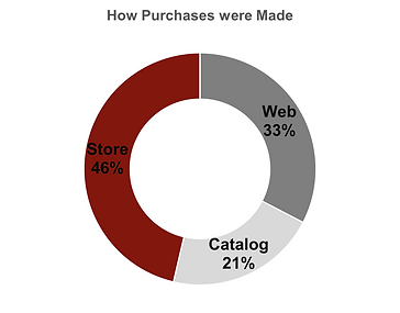
Additionally, looking at how customers are shopping will help us market better to their preferences. This donut chart breaks up the 3 ways in which shoppers can order through DoorDash, which include at the store, on the web, and through their catalog. Most customers purchased items at the store, indicating that marketing strategies should be geared toward this purchasing method.
It’s not only important to look at individual customer patterns, but also comparisons of time frames customers are joining DoorDash. Using a pivot table and column chart, I decided to first look at when new customers are joining the DoorDash app. The early part of the calendar year, particularly January with 223 new customers and March with 216 new customers, had the most new members signing up. These are closely followed by July, August, and September.
Designing marketing campaigns to promote DoorDash deals and memberships can be geared toward late winter and summer, as these tend to have the most customers joining.
Next, we can observe the results of how successful past campaigns were with increasing member offer usage. Using a column chart here to compare offer activity by campaign allows us to see how successful Campaign 6 was with 333 customers using its offers.
Getting a closer look at the campaigns, we can break down each campaign’s activity by age group. I first needed to calculate the age groups using an IF function, then created a pivot table with sparklines to see the details of activity by age group and campaign, and finally using the pivot table to create a column chart for comparison.
Campaign 6 was most successful among all age groups, especially customers aged 36-50. However, people in the age groups 24-35 and 66+ showed the least offer activity overall and the least variance in activity among the campaigns. Thus, targeting the middle age groups for marking would be recommended, as they are the most active customers.
Finally, analyzing what customers are purchasing is our last essential piece. Looking at a pivot table using conditional formatting and column chart, we can see that wine is purchased the most while fruit and sweets are purchased the least overall. The age groups that have the most activity in DoorDash (36-50 and 51-65) are mostly purchasing wine and meat products, which can be another area of focus for future marketing.
Results and Recommendations
From the analysis above, I’d recommend overall that marketing strategies target people aged 36-50 and 51-65, as these age brackets had the most activity and spent the most at DoorDash. The marketing team should examine Campaign 6 to see what made it so successful as well as Campaign 2 to avoid the pitfalls of this campaign. They should also consider creating deals and discounts for popular products like wine and meat as well as the popular source of purchasing (in store). Aiming to release campaigns in the late winter and late summer will support the highest purchasing times of the year and should attract more new customers.
I really enjoyed working on this project and welcome any feedback or questions. Feel free to connect with me on LinkedIn as well!